



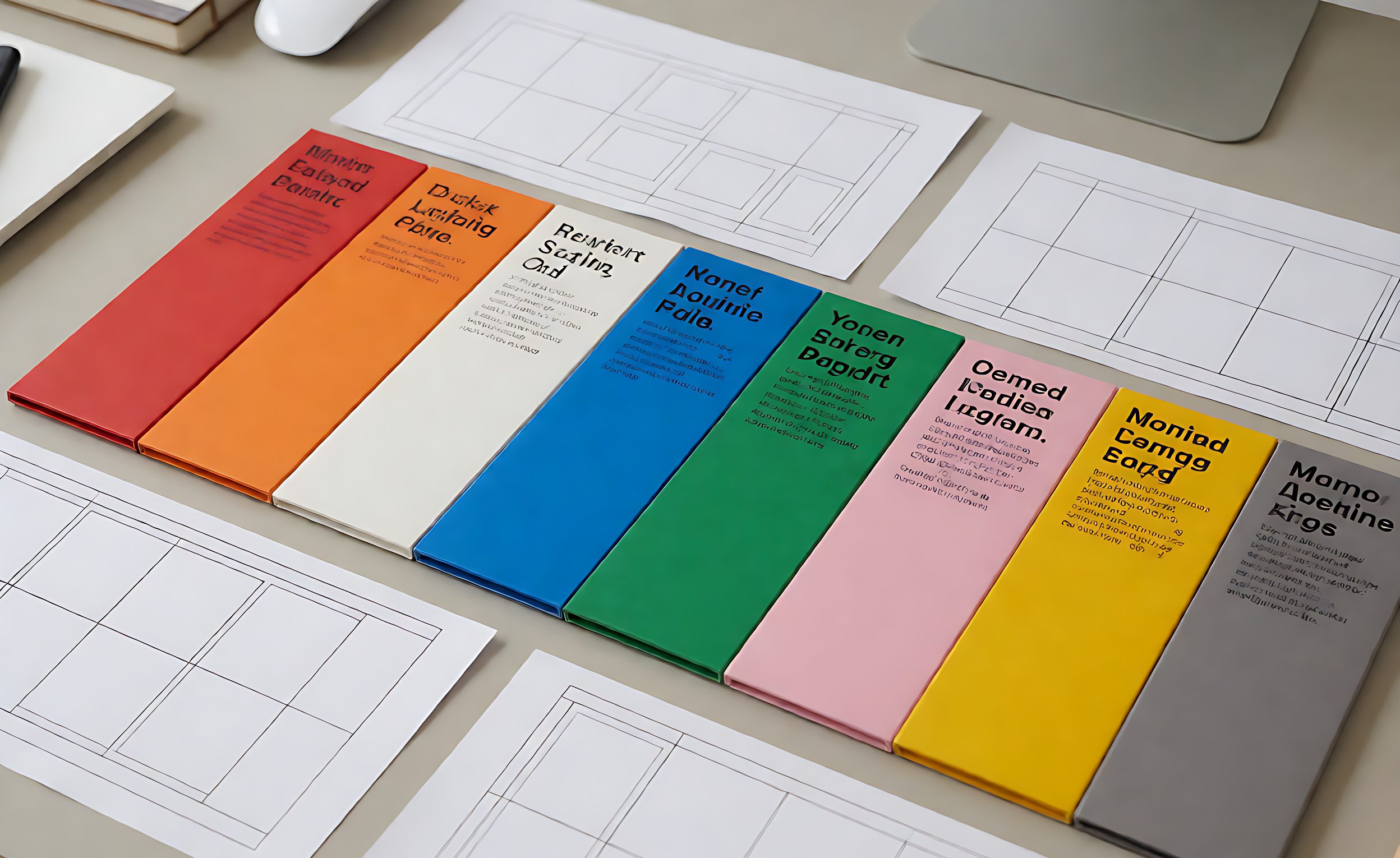

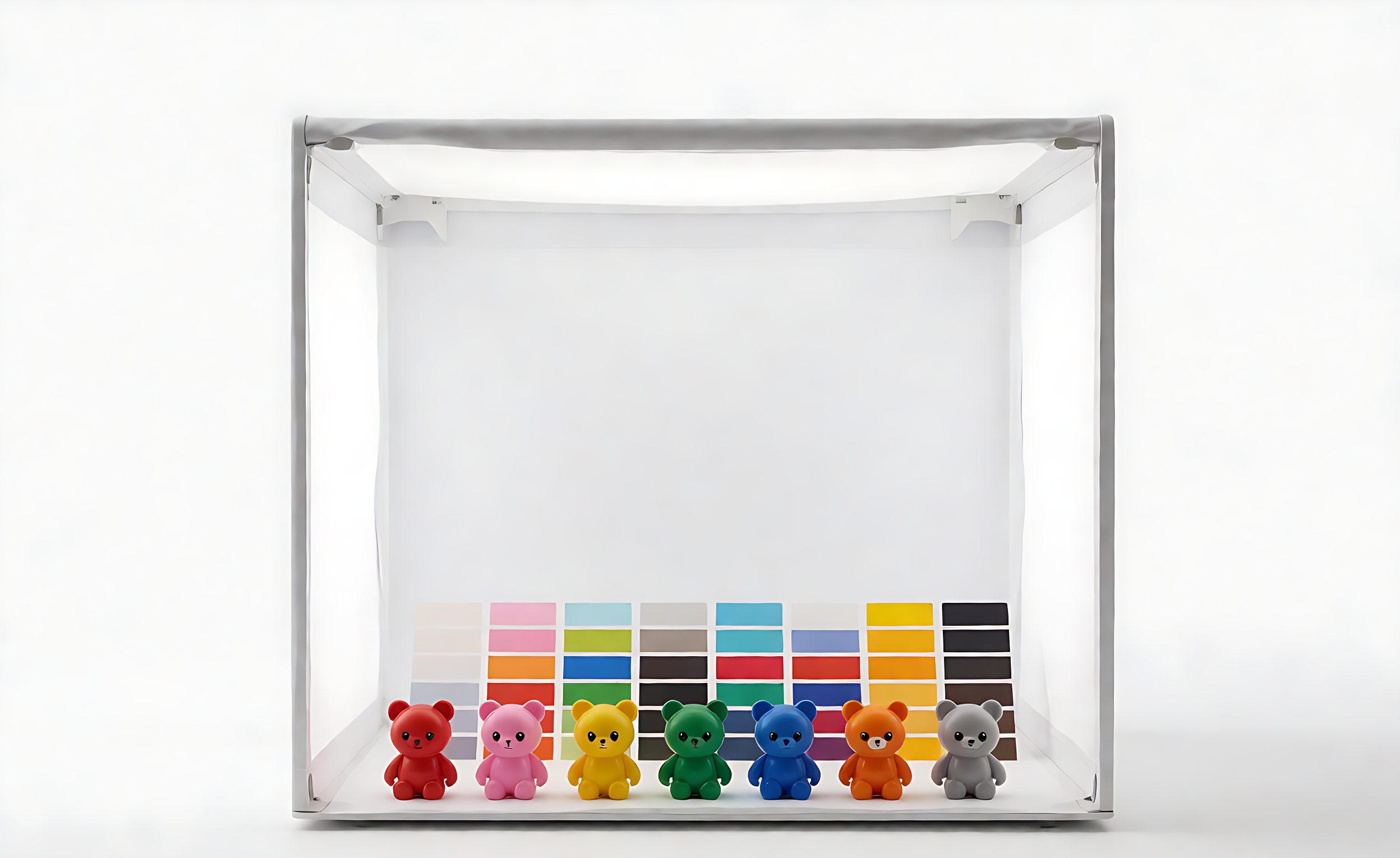
Colour is the attribute customers notice first and specifications describe worst. A reorder that differs from the previous shipment by a small margin is, to a shopper comparing two units on a shelf, obviously a different product. Returns and complaints follow even though every unit passed every functional check.
The problem is not that factories are careless. It is that colour is the output of a chain – base material, colourant lot, mixing accuracy, process temperature, cure time – and each link varies slightly. Without a defined reference and a defined tolerance, there is nothing to hold the chain to.

Where the Variation Comes From
Five sources account for most of it:
- Base material lot. A natural polymer or clay base is not perfectly neutral, so the same colourant load produces a different shade on a different lot.
- Colourant lot and weighing. Small weighing errors on a concentrated pigment produce visible shifts.
- Dispersion. How well the colourant is distributed through the batch; under-mixing shows as streaking or mottling.
- Process conditions. Temperature and cycle time affect the final appearance of many compounds.
- Ageing. Some materials shift after production, and two batches compared at different ages will differ even if they were identical at the press.
The last one causes disputes that are not real defects. Units compared days apart, or a retained sample compared against fresh stock, may differ because of ageing rather than because of a production error.

Specifying Colour So It Can Be Checked
“Match the sample” is not enforceable. A workable specification has three parts: a physical reference retained under defined storage, a lighting condition for comparison, and a numeric tolerance.
The reference should be a sealed unit from the approved pre-production batch, plus a reference card or chip where the product shape makes direct comparison awkward. Storage matters: keep it dark and cool, and replace it on a schedule, because references age too.
The tolerance is a number. Colour difference can be measured as a single value comparing sample and reference, and agreeing on a maximum – rather than on a description like “close enough” – converts an argument into a measurement. For consumer products a tolerance in the low single digits of that scale is typical, tighter for brand-critical colours and looser for pastel or translucent materials.
Controlling It in Production
Two practices do most of the work. First, the factory should reserve enough colourant from one lot to cover the whole order, or at least enough to complete a single shipment, so a mid-run lot change does not appear as a visible step within one delivery. Second, the first pieces of each shift should be checked against the reference and recorded, so a drift is caught hours into the run rather than at final inspection.
For multi-colour sets, specify whether colours within a set must be consistent to each other as well as to the reference. A set where each colour is individually within tolerance can still look wrong if the relationships between them shift.

Технический контекст
Colour difference is quantified as a single number derived from measured coordinates, described under colour difference. The measurement discipline behind it is colorimetry, which defines how colour is measured rather than judged. Keeping a product consistent across materials, processes and reorders is the practical purpose of colour management.
Two Cases That Deserve Special Rules
Translucent and pastel materials. Thin sections and light shades show variation more readily than saturated colours, because a small change in colourant load or section thickness is a larger proportion of what the eye sees. Set a tighter tolerance and, where the product has thin edges, specify the colour at the thinnest point rather than at the thickest.
Metamerism. Two units can match under the lamp in the factory and differ under retail lighting, because the pigments reflect differently across the spectrum. Where a product will be sold under lighting the buyer does not control, specify comparison under more than one light source, including the retail type if it is known. This is the failure that survives a careful single-light inspection and still reaches the shelf.
What to Check at Inspection
Ask the inspector to sample across the shipment rather than from one carton, because drifts happen progressively and a single-carton sample will miss them. Compare under the agreed lighting, against the retained reference, and record the measured values rather than a pass/fail impression.
Where a shipment fails tolerance, the practical question is severity. A difference visible only in direct comparison may be acceptable for one channel and not another, and deciding that in advance – rather than when a container is waiting – is the value of having written the tolerance down.
Colour control connects to the golden sample workflow and to material behaviour discussed in сравнении тактильных материалов. Specification practice for bulk sensory lines is covered in the bulk buyer’s specification guide, and pre-order verification is part of the factory audit checklist.
ЧАСТО ЗАДАВАЕМЫЕ ВОПРОСЫ
Почему цвет варьируется от партии к партии?
Base material lots, colourant weighing, dispersion quality, process conditions and post-production ageing each introduce small shifts.
Is “match the sample” a usable specification?
No. A workable one has a physical reference, an agreed lighting condition and a numeric tolerance.
Как выражается допустимое отклонение цвета?
As a maximum measured difference from the reference, agreed in advance, which converts a disagreement into a measurement.
Should colourant be reserved for one order?
Yes where possible, so a mid-run lot change does not appear as a visible step within a single shipment.
Do retained samples change over time?
They can. Store references dark and cool, and replace them on a schedule so comparisons stay meaningful.
How should a shipment be sampled?
Across the shipment rather than from one carton, because drift is progressive and single-carton sampling misses it.
Does a within-tolerance colour always look right?
Not always in multi-colour sets, where relationships between colours matter, so specify inter-colour consistency as well.